


 The main text layout is in the center of the page it is spread out between 2 columns . This makes it easier to read and is traditional . The start of the text uses a drop capital to improve the iconography of the page.It also invites people to read the article .
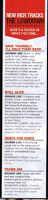
Going down the page is a banner which has the titles of the bands new songs, this keeps the readers updated with the band and keep on track with their music.It also has a little bit of writing explaining what the songs are about which will interest the readers and create a intimate relationship with the band.
 The subheading says 'news' this gives excitement to the reader. It is in large red font to fit in with the colour scheme and makes it stand out. Along side this is 'world exclusive' all in capital letters this is in a banner and is red to make it stand out.
The language used is consultative / informal the band want to create a connection with their fans but still be professional. In the banner the language is more intimate because they say what the songs are about, giving the reader an insight to the band members lives.
How this research influenced my creativity and planning ?
- I like the use of block capitals in the article and think I will use this in my magazine
- I also like the colours used because it matches the genre
No comments:
Post a Comment