This is the final double page spread, I have used the red on her lips on the front cover to create synergy throughout my magazine.


 Question 12 people like the blue and white however some dont like the salmon I will change this to meet my target audience wants.


 I like the layout of this double page spread because of the headline. I like how it is laid on the page. I also like how they used a drop capital . The colours used are plain and I personally dont find them very appealing because of this.I also like that they have used a subheading . The page numbers for this magazine are in the bottom corner, the dps article has 2 columns which have a large gutter in between them.They also use a large drop capital I like this because it's eye catching. The image takes up one page.
 This double page spread has all the codes of its genre which is rock, I dont really like that they have done this because I would like to break conventions .However , I do like the colours they have used, this would be good for my magazine because id like red to create imagery of my magazine . I also like the style of font used for the headline.They use 2 columns with a small gap for the gutter. The font style is in a horror type for the 'wild' which represents the bands genre in music (rock). The font size is very small which I dont like because its not as bold as others I have researched.The image is large and takes up a page and some of the next.
 I really love the colours used on this double page spread, I also like that they have used a pull quote. I also like how this magazine have done their heading. I also like that they have a subheading.The image takes up a page , they have used a large drop capital ton= draw more attention to it. They use 3 columns but I think 2 would have been better because the font is very small. The font is also texted wrapped around a pull quote.
 I like this photo because her facial expression, it creates the image that she doesn't know where she is and is shocked like she is in wonderland.I will have to crop the photo is I am to use it because you can see behind the screen however, this is not an issue because I will use Photoshop for that.
 I like this photo because of her pose, she looks directly into the camera she looks serious, which creates an relationship with the reader.Having her hands near her face suggests shes delicate .She keeps a straight face which intimidates the reader into reading the article .This also needs cropping.
 I like this image because she is pictured with a mushroom and looks shocked by it.This creates humour because she is pulling a funny shocked face which shows the reader she is comfortable.I also like the fact there is a mushroom used a prop, I think it creates the image of Alice and wonderland and portrays it really well, I will also have to crop this image due to being able to see behind the screen.
 I like this one because her back is turned to the camera and she is looking back at the camera, this suggests she is going to go explore where she is and to go look around. It creates the image that she is going on an adventure (through her past). This image also needs cropping due to being able to see the sides but that isn't a problem. however I don't think I would use this one for my double page even though I like it.
 I like this one because she is looking at the mushroom and examining it. It almost creates the image that she is trying to work out where she is and is looking for clues .I like the lighting because it brings out the colour of her costume . However, I don't think the image is straight and I would need to get rid of the sides which I could do on Photoshop.
 We love pop magazine using alot of pink colours , and banners to stand out of the page . This makes the magazine look more appealing. The star image is presented as her being fun and friendly. Its gives the magazine a young look . The model is dressed in a tight dress which (to me) shows she is a pop star this is also given away by the name of the magazine.I think the target audience for this magazine are 11-14 year old girls , I think this because there is a very fun vibe and young look to the magazine , also because they use pink as a code which is normally associated with young teenagers. Pink gives the image of flowers which are normally associated with girls (Barthes). I think the magazine aims at aspires and Tribe wired because most teenagers want to be like the artist in the magazine and use it for their own personal identity (Blumer and Katz). I like the colours used on this front cover as they are bright and fun.
 Q magazine use a lot of red , this represents a rebellion (Barthes) like the magazine wants to break codes and conventions and break the rules . The star image is shown as serious and intimidating because his eyes cannot be seen. He is also standing very close to the camera which creates and image of him being ready for a fight. The image shows the other band members in his glasses this suggests he is ready to make music and he is in control .I think the target audience for this magazine is 20-30 year olds male and female however, the colours used and image on this cover are more targeted for men.I think the readers will use this for entertainment eg relaxing ect ( McQuail). Main streamers will be attracted to buy this magazine for the brand name because of how well known it is.
 Rocksound magazine present a dark gruesome image on their front cover , this is a convention of rock magazines. The background is black and very dark creating a mysterious and horror look to the magazine.The red represents blood and the black and dark colours represent evil (Barthes).The star image has many tattoos which is a code for rock , they are all looking into the camera which creates a intimidating feel to the magazine. The target audience for this magazine would be 17-25 because this magazine sometimes contains language which would not be suitable for younger . I think this magazine will appeal to aspires who would buy for the brand name (Blumer + Katz) and used for diversion and personal identity (McQuail).What I like about this photo is the way the stars are presented and the effects of the picture.
 I would like to have the theme for my double spread Alice and wonderland however , I will change this to Alex in wonderland after my star.
 I like this font because of the style . I chose the colour because blue is often used in jazz magazines.
 I like this because there is a shadow and this breaks conventions of mastheads because this is not normally done . This font was not popular in my research and only 2 out of the 10 people i asked choose it.
 This font is similar to the second but a different style. I also like the shadow on this for the same reason as the other.
 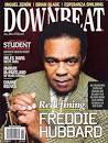 The star is represented to be inviting but the more young stars have attitude by not looking in the camera, they create a more rock n roll attitude to make the magazine more modern.This ties in with dyers theory he looks to be smart and sophisticated, this therefore suggests people would treat him with more respect.I think this also backs up Richard Dyers theory of how the artist is seen is how they are treated. Because the artist looks calm and inviting meaning others will be more comfortable reading his feature [representation theory].


 This front cover photo is taken while the artist is playing a concert. This is breaking conventions however, many Jazz magazines do this. He is dressed in a suit which is a code and convention of jazz, he is also pictured with instruments which is also a convention for jazz magazines and they do this regularly. He is looking away from the camera this is a convention of jazz magazines , it shows he is focused on something else.I dont like this because I dont feel like it interacts with the reader, I wouldnt use this background for my magazine.


