Monday 31 October 2016

Research: Consolidating My Research

Double Page Spreads 

DPS +1 
This showed me how to layout my double page spread , I have decided I will copy this layout by having an image take up a page of the double page spread . It also showed me what to include, it has shown me what to write about. I also like the dark colours used in the photo and background because it matches the theme. It has also shown me how to have half the page as an image , this has shown me how to set my article around this. 

DPS+2
 I like the use of block capitals in the article and think I will use this in my magazine. I like the way it stands out on the page and draws attention to the article . I also like the colours used because it matches the genre  and reflects the article its self and the band.

DPS+3
I dont like the quality of this picture, it seems low quality and old. I would like to create a more modern magazine so this would not work for mine. However, I like the colours used the blue creates a soft and cooling feel to the magazine. 

DPS+4
I like the colours of the double page spread, they use dark colours because of the topic the article is about. I also like how the picture contrasts the article topic. The article its self is dark and is about dark topics and the picture is more fun which is a huge contrast . 


Front Covers 

FC+1
I like the black and white background I plan on using this on my own magazine.I dont like the masthead being partly covered because it doesnt make the magazine desirable since people might not recognise it .I like the fonts being in a bright colour against the black and white background because it stands out more I dont like the poses the artist has used since they look very intimating which  I dont want for my magazine. 

FC+2
I love the photography I think i will use this  for my magazine , its sophisticated and is very detailed . I dont like that there isnt much text on the cover, I want my front cover to be informative which this cover isnt however, it creates a more sophisticated feel to the magazine.  I also really like the letters being more spaced out, it draws more attention to the heading. I dont like the masthead not being as bold as it is on some other magazines that i have seen.

FC+3
I like the style of the  font used on the front cover, its different to other magazines that I have seen however , is used in Q alot.I dont like how busy the magazine is and will try make mine less like this because I want mine to be more sophisticated. I like how the magazine changed the masthead to fit in more with the artist they are covering .I like how this magazine uses the box outs to display names.I like the pain background because it draws more attention to the artist. 
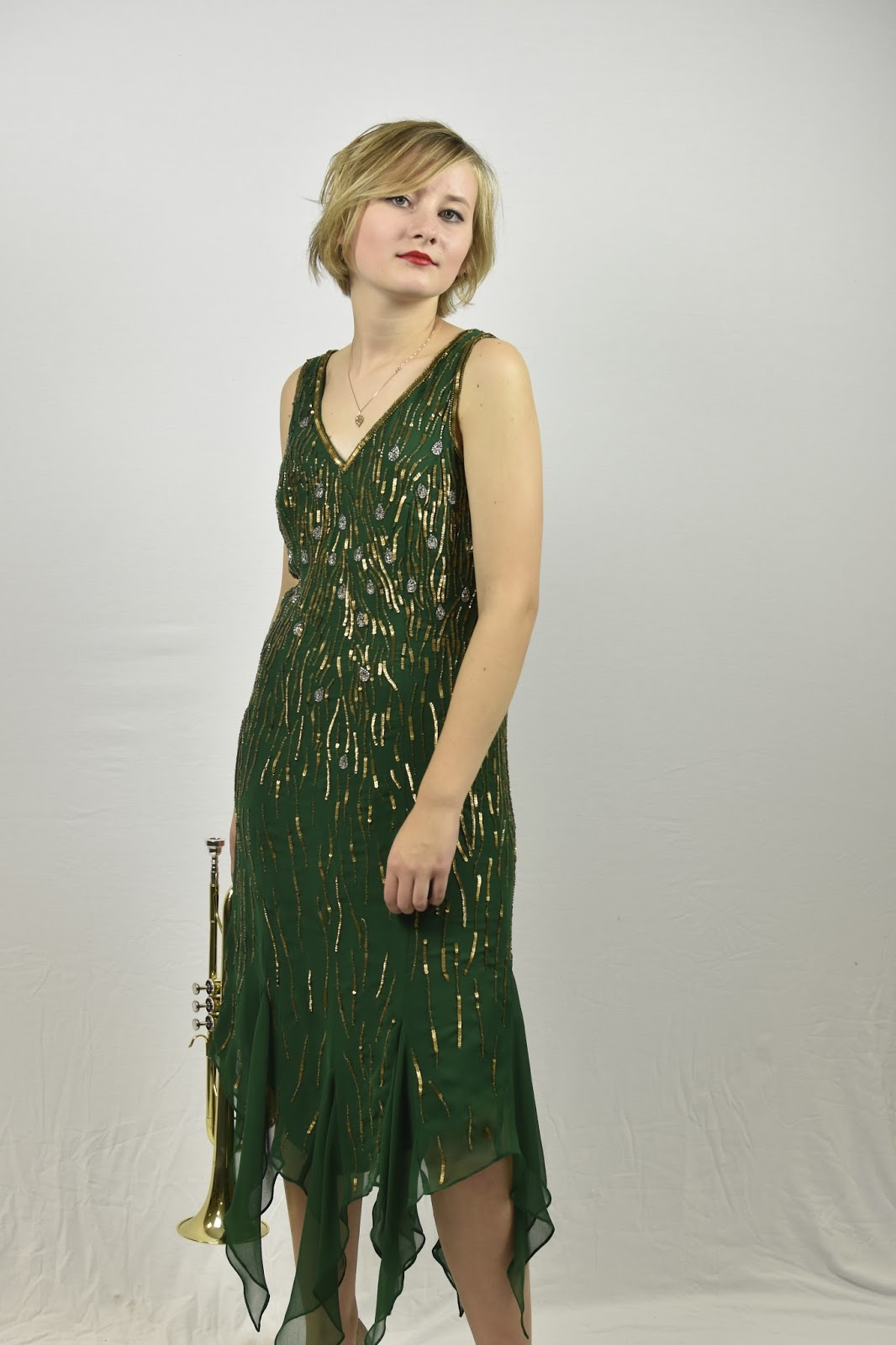
FC+4
I love the photography used, Its good quality which will draw more attention to the magazine .  I think i will use this  for my magazine. I dont like that there isnt much text on the cover, id like my magazine to be more informative. I like image the star creates , since I am creating a jazz magazine I can used this kind of image for my own star. 

FC+5
I dont like this magazine front cover because of how plain and old fashioned it is , the image isnt very high quality and is very plain. This magazine has an older target audience , which my magazine does not. 


Contents Pages

CON+1
I like how they have used red as a constant theme.I will use a constant theme of colours throughout my magazine to create a more recognisable image. I also like how it has been set out however, I wouldn't use this for my magazine. 
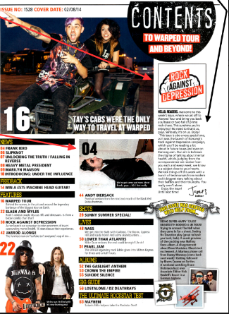
CON+2 
I like how the text has been wrapped around the image , I would use this for my magazine because it shows how important the image is. I dont like that there isn't many photos on the contents page , I will use more for my magazine. I also dont like the font used so I will try a different style on my magazine . 

CON+3
It shown me that an editors letter is important ,  this is important because it creates a relationship with the reader and because of this I will feature this in my magazine . This is a convention of Jazz so it will work . It has made me see that competitions are important to readers and i will include one in my magazine, it creates m,ore interests in the magazine .


Angel Suite 3 photos


These are some of the photos I took at the angel suite , I organised a photo shoot at the venue. I will use these images for a competition in my magazine. The competition will be to dine her for free. This is because my magazine is targeted at students who would not normally afford to eat here. 

Thursday 27 October 2016

front cover analysis +6

DPS Analysis +4

The medium is a double page spread article, one of the pages is an image and the other is the article. The headline is in bold and uses 2 different styles of sans serif font. It is white which contrasts on the black background. This creates a spooky feel to the article. By using the word 'eating' it creates the image of a monster which also fits in with the black background. Using the colour white for the font is a code for jazz so it follows conventions. It is written in capitals to draw attention to the article and show its worth the read. Having the artists name in a different style of font draws attention to it more than the rest of the page, they did this because it will appeal to her fans and will make them read the article more.

There is also a subheading in the article , it is in a bold white font which again is a convention of jazz. This makes it stand out and it uses words like 'sex' and 'drugs' this creates a more rock and roll image to the reader which breaks conventions for jazz because it is not normally associated with jazz. This gives the artist an attitude which  links with Dyers representation theory. It shows that the way the article will have influence on how she is now seen. The subheading also gives the reader a hint of what the article is about and gives them a preview. This will help the reader decide if they want to read the article or not.

The image shows Amy (the artist ) in all black with eyeliner, this is breaking conventions because this is a code for rock. She isn't looking into the camera however, she is pulling a funny face this creates a relationship with the reader because she is showing a fun side to her self. This will help her interact with her fans and the readers of the magazine.The photo is a medium close up. The lighting is bright on her face to draw attention to her facial features and expression. She also has tattoos this is also against conventions. Not looking directly in the camera is a code for jazz. The picture takes up half of the double page spread showing how important she is .
On the left hand top corner there is a caption describing the picture . On the bottom of the page is the page number, dateline of when the article was published and the magazine name. The picture supports Mulvey's theory because she is made to look sexy and is in a pose that shows off her curves .Having the image on a dark background makes her stand out more which draws more attention to the artist.

The text is white and uses the font serif . The font size is small , however the colour draws more attention to it on the page because of the background. The text also uses a drop capital this shows the reader where the article starts and makes it stand out more.The drop capital is the same letter of the artists name , this is common in jazz magazines so is a code. The article uses a two columns and is separated by gutters. The language used is a intimate and consultative register.It is intimate because it the artists talks about some hard and personal topics , and the interviewer talks to the artist in a consultative register because they have to be professional. The domain changes because of who is talking, the artist is more relaxed however, the interviewer is more formal. The tenor changes on different topics, if the artist is talking about something personal then she is more intimate and relaxed because she wants  her fans to understand . The article contrasts with picture because the article is deep and intimate and in a way sad, while the picture puts out a fun image.


The colour scheme matches the article because of the theme and topic talked about, they picked dark colours to show she was in a dark time and the white shows shes trying to get better , a connotation of white is that it is pure .


How this research influenced my creativity and planning ?

  • I like how the colours match the article topic
  • I also like the contrast of emotion from the picture to what the article discusses 

DPS analysis +3


The headline is in bold white font, this draws attention to the article. It is in capitals , this shows its important .The font is very simple this to keep all the attention on the artist which is featured. This is common in a jazz magazine . The font is serif which is a convention of jazz. Using the colour white is a convention of jazz magazines. It gives the image off that the artist is pure and calm. It could also mean that the magazine is pure and is calming to read.  It says the date of the artists life which creates a more intimate relationship with the reader . The letters are white to show respect to the artist .


There is an introduction to the article under the headline.They use words like 'lost' and 'legendary' this contrasts each other. It is showing that the artist was loved by many and creates a intimate connection  . It is formal , this because of the topic it is about, it would be inappropriate to have the language informal because it would be disrespectful.It is written in white to keep the article pure . The colour white also makes the text bold and stands out on the blue background behind it.

The image takes up a whole page , the artist looks directly at the camera creating a connection with the reader.This makes the article more emotional because he has died.  He has his arms folded this shows him as professional and ready to make music. It also shows him as serious and that music is very important to him. He is wearing a suit which is a convention of jazz.  The article looks like it would be targeted to an older generation, this is because of the artist he is of an older age in the photo also because of the way the articles layout. It is very plain and boring this would not appeal to a younger audience. The blue of the background creates a cool and calm feel , however, it could represent sadness because the artist has passed away. There is only one image on the page so all focus is on the artist .

The text is set into three columns which are spaced out with a gutter.  It has small sized text and has a lot of writing this would not appeal to a younger generation.  The language used is intimate and formal register  . This is because of the contexts of the article.The medium  is a double page spread and uses tenor because it changes when speaking or quoting different people.

How this research influenced my creativity and planning ?

  • I dont like the colours that are used
  • I dont like the image quality 

Friday 21 October 2016

Concert Pictures


These are some images I took at a concert which I plan on using . I intend to use these on my contents page for a review for the gigs .

selection and rejection

I like this photo because of the lighting, it creates a moody attitude and because my model doesn't look at the camera it creates tension. It gives jazz a rebellious attitude which breaks codes .
I also like this photo because the model is smiling this inviting to the reader. It creates a relationship with the reader because its shows they both enjoy music. I also like this because she is holding a trumpet this will give her a professional image . It is also a different pose because she is seated this shows she will be comfortable answering questions in the article.
This photo is the best one because it makes her look glamours , this supports dyers theory and also Murvey because the star is an image and the star has a sexy pose which will attract men to read.The only thing bad about the photo is that you can see behind the background however, this wont matter because I can crop this out of the photo.
I like this photo because the model looks directly in the camera creating a relationship with the reader however, she has a moody facial expression. This suggests she is serious about her music and is serious about her fans getting to know things about her and her music. I also like the pose she does in the photo because it makes her look attractive. 
I like this photo because she looks away from the camera this suggests she is concentrating on her music. I also like this because she is holding an instrument , this shows her skills and that she loves her music . I also like this because she is sat down showing her outfit and a bit of her shoes . 

Wednesday 19 October 2016

Photoshoot 2

I used a Nikon D7200 DSLR fitted with a 35mm prime lens to take my images. I also used a tripod and continuous lighting with soft box with a plain white back ground.
This photo shows me taking a picture of my model (Greta) in order to break conventions I made greta look directly at the camera. I took all my photos on this background , however, I plan to use a range of backgrounds, to break conventions. This shows me using the camera and directing the model on how to pose. I learned how to use the tripod to get a range of shots and different camera angles . I also learned more camera skills and how lighting effects the mood and the representation of the image. I dressed my model in a green 1920s\30s dress to fit with my theme she wore red lipstick and eyeliner to create a contrast with the dress. Shooting this on a white background follows conventions of jazz , normally they use photos from a studio or a recording studio. However, I do plan on breaking these conventions as well as following them.


I found it easy to direct my model and get the poses I needed for my magazine. However, I found it difficult to think of how I wanted her to pose and stand, but i gradually got better at this with taking more photos. I did go over the edge of the background a few times so you can see the surrounding area but this can be easily solved by cropping my images I want to use . The model was well lit which created a more positive feel to to the photos . I have a range of shots of my model in different poses eg sat or with an instrument .  I followed conventions of Jazz because I photographed my model with a trumpet and saxophone , this is because they are known to be jazz instruments .

I found framing the photos to fit hard because I needed the model to fit in the picture even though it isnt a problem I have learned for my next shoot how to . I also found setting up the tripod hard at first however , I soon got used to it . I struggled moving the camera in the position I wanted it to be in. I also found it hard to move the camera so then the photo would not go over the background.

I found working with the lights easy. I used a variety of lighting , I used darker lighting by moving my model more away from the light to create more tension in the photo . I wanted the picture to have a moody attitude and more drama. I did use a bright lighting on most my photos so all the attention and focus more on the model.

Getting the emotion in my picture was easy, my model listened and took what I said and did it straight away which helped me get good photos . There is a range of photos with different emotions. I created a moody and mysterious emotion by getting my model to look away from the camera. This made my model look intimidating. To create a more positive emotion I made my model look directly at the camera. This creates a relationship with the reader and makes the reader connect more to the magazine .

I didnt stick to my plan because i was unable to shoot my model on another background in a different dress however, I will do this. I also didnt stick to my plan because I didnt do the models hair as originally as planned. Instead of finger waving her hair I decided to make it more modern by doing it messy . However, I did stick to to some of plan because I did use the make up I planned on using. I used the same makeup as my research I did. I liked the look so copied it on my model to create the 1920s era I wanted.

Tuesday 18 October 2016

Photoshoot

Today I had a photo shoot for my magazine. I did this at school where I used different backgrounds and could use different lighting. My model wore two different outfits and we used two different backgrounds. The first outfit she wore was black with red shoes , this photo was taken in front of a church like background. The second outfit she wore was a green dress with a gold bag and gold shoes . She had the same style make up throughout these pictures.

Initial Ideas Creativity Post

I have chosen to do a jazz magazine because I want a more modern magazine for people my age .I  have chosen to do the colours as yellow and blue which breaks codes because yellow is not normally used.  For my front cover I will dress my model in two different outfits , the style my model will be dressed in is 1920s with a modern twist .The barcode will be down the side of the magazine.
My contents page will be at least 2 pages and will have mostly images on , it will include images of competition prizes . I will also include an editors letter to create a more personal connection to the magazines readers. I will also include some concert images which is a normal feature for jazz magazines.This will have any names of social media accounts the magazine will have.Some features in the magazine will be a concert review and a advice section. There will also be a section on this where some tweets will be included by some of the readers of the  magazine , this will create a connection with the readers and attract more young people to read the magazine because it is keeping up with technology.
My DPS will have the first page  as a full image and the article on the second page with smaller images . I will use the same model as my front cover.I will  include drop capitals to add a bold feature into the page.

I will use Greta as my model who is a student so will be in the same age range as my audience . I have also picked her because she has short her which is what I wanted my model to help create a more 1920s look . I will make my model wear 2 dresses one is black and one is green. I plan on doing her make up by using eyeliner and red lipstick to match her shoes she will be wearing. She will look directly in the camera there will be a range of shot lengths eg close up and medium. This links to Dyers theory because I am making the star into an image.
My DPS will be about the stars rise to fame and the story behind how they got where they did in the music industry.

The codes I will break for my genre are the colours and the font. I want my magazine to stand out from the rest.I will also break conventions by using different backgrounds for my photo , instead of being in a studio which is normally a code and convention for jazz I will use more adventurous and different back grounds to try create a different image for my magazine and attract a different target audience.

Sunday 16 October 2016

Research of DP's 2


The headline consists of 2 colours red and white.Red is a code for rock and represents violence and rebellion. However, it also reflects the passion the artists have for their music . It contrast with the black background making it stand out more .The text also has slits in it which is consistent from kerrang it makes the font look slightly scary which is also a code for rock. Underneath this is a mini introduction to help readers get an idea of what the article consists of.
There are multiple  images which draw the reader in ,having lots of photos of live gigs will interest the reader and will make them more interested in reader the article .

The main text layout is in the center of the page it is spread out between 2 columns . This makes it easier to read and is traditional . The start of the text uses a drop capital to improve the iconography of the page.It also invites people to read the article
Going down the page is a banner which has the titles of the bands new songs, this keeps the readers updated with the band and keep on track with their music.It also has a little bit of writing explaining what the songs are about which will interest the readers and create a intimate relationship with the band. 
 The subheading says 'news' this gives excitement to the reader. It is in large red font to fit in with the colour scheme and makes it stand out. Along side this is 'world exclusive'  all in capital letters this is in a banner and is red to make it stand out.

The language used is consultative / informal the band want to create a connection with their fans but still be professional. In the banner the language is more intimate because they say what the songs are about, giving the reader an insight to the band members lives.
How this research influenced my creativity and planning ?
  •  I like the use of block capitals in the article and think I will use this in my magazine 
  • I also like the colours used because it matches the genre 


Angel Suite Photoshoot

Today I went to the Angel suite to take some images of the building to be included in my magazine. I will use the photos for my magazines competition . However, I was going to bring a model with me but they couldn't make it . I took pictures of the main hall which will work well for my magazine. I thought it was a good setting because of how grand it was.

Saturday 15 October 2016

Contents Page 3 + Kerrang

Kerrang


The black , red , white and yellow combination go together well as it is aesthetically pleasing.It compliments the rock genre of kerrang . The red represents rock because it shows the anger and rebellion in their music however, it also shows the passion the artist and magazine have .It also suits the logo ''rock against depression'' campaign that Kerrang launched in this issue. This makes the logo stand out.


Band names are in bold, larger font size and capitals, this will help the reader recognize the article they want to read in the magazine it makes them stand out against their straplines . Kerrang's target audience would most likely be fans of these bands.

The three main images have the page number of the article that they relate to presented on them. It is written in a colour that contrasts with the colour they overlay.however, it also compliments it.The image shows them on a vehicle , this suggests they are breaking the rules which is a representation of rock.They are wearing black jeans which is also a representation of rock .

There is a buzzword used ''WIN'' this attracts their audience to buy the magazine as they may get something extra for their money . A guitar is offered which would appeal to the kerrang target audience  as it would appeal to rock fans and in particular the band that is featured in the puff with this.

Most issues of kerrang has a short message from the editor usually in the column inch to the readers to add a more personal feel to the magazine and to set up a relationship with its readers.Creating a possible feel of loyalty .


 Though the contents page masthead ''contents'' is layered slightly over the center image , it does not obscure either members . Some readers may reconigise this by the distressed font and chaotic and dark style the bands that feature in kerrang as it is a punk / rock magazine. The font used for the masthead is often a code for rock.

The contents page has a clear layout .

How this research has influenced my planning and creativity ?

  • It shown me that an editors letter is important
  • It has made me see that competitions are important to readers and i will include one in my magazine


Friday 14 October 2016

Synergy , links and brand identity


Image result for music magazines Vibe has a brand identity, even though the masthead is covered by the models. The masthead is blue is unconventional because it is normally red however , it is still recognizable  .


The contents page however, is black and white which is a contrast to the front cover which is colourful and bright.


The red is carried on to this page because there is a love heart which is near kanye's chest this suggests the article about him is intimate.Looking at the image you can tell its a vibe magazine because of the quality of the image and the style . They often have the artist looking into the camera .


Image result for vibe contents page

The text is in a column at the side on the picture which is often done in vibe magazines . The contents page is not very busy however, it does have alot of information on it. In the background is the V for vibe which is often done which creates more of a brand identity and makes the magazine more recognizable.


Possible mastheads for my magazine


These are some ideas  for possible mastheads for my jazz magazine

I like this font , I would use this for my masthead because it is different and bold. I would do each letter a different colour or make it bold yellow.


    I like this because it is more sophisticated and would look good in the colour blue. I also like it because of the way the letters are closely together. 
Image result for hand writing font

I like this font also because it is handwriting which is often a convention for jazz magazines .


How this research has influenced my planning and creativity?

  • It has shown me which fonts I prefer
  • I have chosen to use the 'PRISMA' font
  • It has also shown how i can break the conventions and codes used for jazz magazines 

Tuesday 11 October 2016

Magazine ideas +2


 This is the hair style I want my model to have on my jazz magazine , this represents my 1920 theme for my jazz magazine.


This is the outfit my model will wear. It is plain but also is the style of 1920s . She will wear a black dress with red shoes so I can emphasise the colour with photoshop.

I like this style of make up, it is plain . If I use this for my magazine I will have the lips a brighter red.

Monday 10 October 2016

Magazine ideas 1

I like the models hair in this photo , it has a real sense of 1920s style and that's the image I want to create for my magazine. Because i have chosen to do the genre of jazz I think this look would work well. I also like her outfit , this also portrays a 1920s vibe which I like. I don't like her make up since I want to do a modern twist to my magazine and think the make up is to old fashioned.