Kerrang
 The black , red , white and yellow combination go together well as it is aesthetically pleasing.It compliments the rock genre of kerrang . The red represents rock because it shows the anger and rebellion in their music however, it also shows the passion the artist and magazine have .It also suits the logo ''rock against depression'' campaign that Kerrang launched in this issue. This makes the logo stand out.
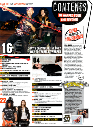
 Band names are in bold, larger font size and capitals, this will help the reader recognize the article they want to read in the magazine it makes them stand out against their straplines . Kerrang's target audience would most likely be fans of these bands.
 The three main images have the page number of the article that they relate to presented on them. It is written in a colour that contrasts with the colour they overlay.however, it also compliments it.The image shows them on a vehicle , this suggests they are breaking the rules which is a representation of rock.They are wearing black jeans which is also a representation of rock .
Most issues of kerrang has a short message from the editor usually in the column inch to the readers to add a more personal feel to the magazine and to set up a relationship with its readers.Creating a possible feel of loyalty .


Though the contents page masthead ''contents'' is layered slightly over the center image , it does not obscure either members . Some readers may reconigise this by the distressed font and chaotic and dark style the bands that feature in kerrang as it is a punk / rock magazine. The font used for the masthead is often a code for rock.
The contents page has a clear layout .
How this research has influenced my planning and creativity ?
- It shown me that an editors letter is important
- It has made me see that competitions are important to readers and i will include one in my magazine
This will be a secure Level 3 post with a couple of improvements. Analyse the images in more detail (be sure to add representation theory). Consider how representation has been created through costume, location, pose etc. You also need to highlight subject terminology.
ReplyDeleteI have edited this post to make it better and have now highlighted .
ReplyDelete